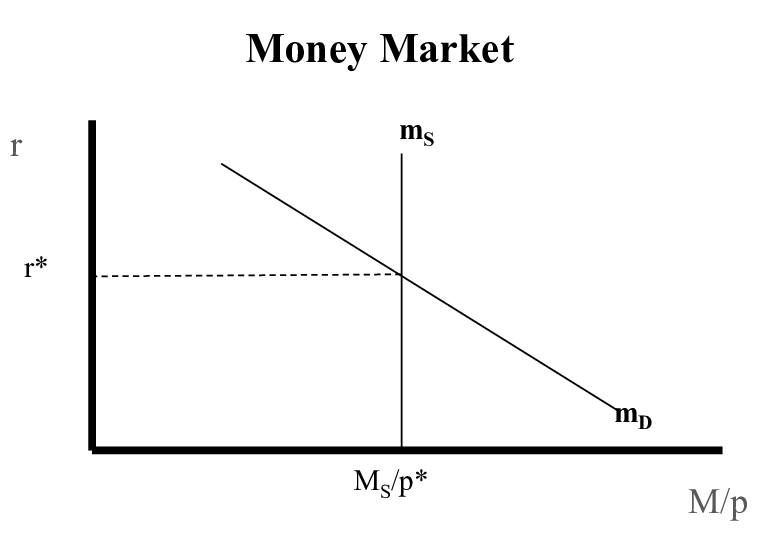
Money market graphs show how nominal interest rates balance money supply and demand in an economy. These graphs differ from traditional market graphs. They feature a downward-sloping demand curve (Dm) and a perfectly inelastic, vertical supply curve (Sm) that creates a unique equilibrium point.
AP Macro students just need to analyze monetary policy effects through these graphs. The central bank’s control over money supply becomes clear. Tight monetary policies make the supply curve move inward and raise interest rates. Easy money policies push it outward and lower rates. The graph reveals how interest rates connect with the amount of money people hold for transactions and speculation.
This piece will help you understand the money market graph’s structure and teach you to draw and label it correctly. You’ll learn why demand and supply curves move and see how this connects to other economic models like the loanable funds market graph. Students preparing for exams or anyone wanting to grasp monetary policy better will find everything they just need in this breakdown of this essential economic tool.
What is the money market graph used for?
The money market graph is a vital tool economists use to learn about how interest rates react to changes in money supply and demand. This graph is the life-blood of monetary theory and shows how central banks’ monetary policy decisions affect economic conditions.
Shows how nominal interest rates adjust
The money market graph shows the way nominal interest rates adjust to balance the economy. The graph shows money’s price (the interest rate) and its response to market forces. Economic theory tells us that people keep less money as interest rates climb above rates from money deposits because it costs them more to hold it. People tend to keep more money when rates drop.
This connection creates the downward-sloping money demand curve. The negative slope shows that people want more money when interest rates fall. To cite an instance, see what happens when the Federal Reserve adds more money supply – the supply curve moves right and equilibrium interest rates drop. Since March 2022, we’ve seen this happen as Money Market Funds (MMFs) yields rose 4.13 percentage points – this is a big deal as it means 97% of the effective federal funds rate increase.
Illustrates equilibrium between money supply and demand
The money market graph clearly shows the balance between money supply and demand. The market reaches stability when people want exactly the amount of money that’s available. This balance sets the common interest rate, which appears where the money demand curve (Dm) meets the vertical money supply curve (Sm).
The market naturally fixes itself when it’s out of balance:
- At higher interest rates: Rates above equilibrium (r1) create extra cash as money supply exceeds what people want to hold. People buy more bonds, which raises bond prices and lowers interest rates back to balance.
- At lower interest rates: Rates below equilibrium (r2) cause cash shortages because people want more money than what’s available. This leads them to sell bonds, which drops bond prices and pushes rates up toward balance.
Central banks control this system by managing money supply through monetary policy tools. John Maynard Keynes showed that money finds its “price” exactly where supply meets demand.
Used in AP Macro to analyze monetary policy
AP Macroeconomics students use the money market graph to see how monetary policy shapes the economy. The 2017 AP Macroeconomics Exam featured this graph. Students discover how central bank actions like open market operations, reserve requirement changes, and discount rate adjustments move the money supply curve and change interest rates.
The money market graph links to other economic models. It reveals how interest rate changes affect investment spending, aggregate demand, and GDP growth. Research shows that when the effective federal funds rate rises by one percentage point, money market fund industry assets grow by about $150 billion over two years. This proves that monetary policy creates waves across financial markets.
Students also use the graph to understand how the money market and loanable funds market work together. These markets set interest rates and help the economy grow or shrink based on central bank decisions.
Understanding the structure of the money market graph
You need a clear grasp of the money market graph’s unique structure to master it. The structure is substantially different from regular supply and demand graphs. This framework shows how interest rates work with money supply and demand in an economy.
Vertical axis: Nominal interest rate (n.i.r.)
The money market graph’s vertical axis shows the nominal interest rate, commonly written as “n.i.r.” or “i”. Most economic graphs display price on the vertical axis, but this one uses interest rates. These rates represent money’s “price” or the cost of keeping money instead of other assets. The rates shown are nominal, which means they don’t account for inflation.
Horizontal axis: Quantity of money (QM)
The quantity of money (QM) appears on the horizontal axis and shows the total money supplied and demanded in the economy. It measures the actual amount of currency and deposits that economic players want to keep at different interest rates. Labels like “Q$” or “Quantity of Money” help distinguish this axis from other economic graphs.
Downward sloping demand curve (Dm)
Money demand curve (Dm or MD) slopes down from left to right and shows how interest rates relate negatively to the amount of money people want to hold. The downward slope reveals a basic economic truth: people hold less money as interest rates climb because keeping cash becomes more expensive.
High interest rates push individuals and businesses to keep their wealth in assets that earn interest rather than cash. Lower interest rates make holding money cheaper, so people keep more cash.
Vertical supply curve (Sm)
The money market graph’s most unique feature is its perfectly vertical supply curve (Sm or MS). Product markets typically have different supply curves, but the money supply curve stays vertical because interest rates don’t affect it. The central bank’s monetary policy choices determine where this vertical line sits.
Central banks like the Federal Reserve in the United States control money supply through tools such as open market operations, reserve requirements, and discount rates. Policy changes move the money supply curve sideways instead of along the curve in response to interest rate changes.
Equilibrium point and interest rate
Money market equilibrium happens right where the money demand and supply curves meet. The quantity of money demanded matches the supply at this point, which creates a stable interest rate in the economy.
This equilibrium interest rate plays a vital role in shaping investment decisions, consumption patterns, and economic activity. The central bank can raise the equilibrium interest rate by implementing tight monetary policy and moving the money supply curve left. This discourages investment and consumption. Moving the supply curve right creates an easy money policy that lowers the equilibrium interest rate and boosts investment and consumption.
A solid grasp of this structure helps you analyze how monetary policy shapes interest rates and the broader economy.
How to draw and label the money market graph correctly
Drawing money market graphs the right way takes careful attention to detail, especially for AP Macroeconomics students. The right labels are vital not only to pass exams but also to analyze how monetary policy works in the economy.
Use standard abbreviations: n.i.r., Dm, Sm, QM
A good money market graph starts with clear, standard abbreviations that show each part. Here’s how to label your graph:
- Vertical axis: Write “Nominal Interest Rate” or use “n.i.r.” (or “NIR”)
- Horizontal axis: Write “Quantity of Money” or “Q$” to show money amount in the economy
- Money demand curve: Use “Dm” or “MD” (slopes down from left to right)
- Money supply curve: Use “Sm” or “MS” (draws straight up and down)
You can also use RR (Reserve Requirement Ratio), ER (Excess Reserves), and I (Investment) to link to bigger economic effects.
Label equilibrium interest rate on the vertical axis
The point where money demand meets supply must show clearly on the vertical axis. This spot shows where money demanded matches money supplied.
To get this right:
- Draw a line straight across from where the curves meet
- Put a specific rate value on the vertical axis (like 5%)
- Mark it with a small “e” or write “equilibrium rate”
Note that any equilibrium changes should show both old and new rates side by side.
Use arrows to show shifts and changes
Arrows help show how monetary policy or economic changes work in the money market. Here’s how to use them:
- Solid arrows show which way curves move (left or right)
- Dotted lines across and up show new rates and money amounts
- Connect cause and effect with arrows – like showing how more money supply brings rates down
These arrows help track complex cases like open market operations and their effects on rates, investment, and combined demand.
Avoid common labeling mistakes
Students often make these mistakes on money market graphs:
- Wrong curve slopes: Money demand (Dm) goes down while money supply (Sm) stays straight up
- Missing meeting points: Always mark where curves cross and show that interest rate
- Wrong axis names: The vertical axis must say nominal interest rates, not just “price”
- Direction mix-ups: Make sure arrows show rates going up (left shift) or down (right shift) correctly
The right labels help connect money market changes to their effects on investment and total demand clearly.
What causes shifts in the money market graph?
The money market graph moves based on economic factors and policy decisions that change money demand or supply. These movements create new balance points that affect interest rates across the economy.
Changes in money demand (e.g., GDP, price level)
Several key factors cause the money demand curve to move. GDP changes directly affect how much money people need – higher GDP means businesses and households need more money to handle transactions, which pushes the demand curve right. Price changes play a similar role. A 20% price increase means people need about 20% more money to buy the same things.
The money demand also changes because of other factors. People’s expectations about falling bond prices or rising inflation make them adjust how much money they hold. Lower costs of moving money between accounts reduce how much cash people keep handy. Individual risk priorities and cash needs affect whether people choose to hold cash or other assets.
Monetary policy tools: open market operations, reserve requirements, discount rate
Central banks use three main tools to move the money supply curve.
The Fed most often uses open market operations. Buying Treasury securities adds reserves to banks, which pushes the money supply curve right and brings interest rates down. Selling securities does the opposite – it reduces money supply and moves the curve left.
Banks’ lending ability changes with reserve requirements. Higher requirements mean less money supply because banks must keep more reserves. The discount rate works the same way. Banks pay this rate to borrow from the central bank. A higher rate means less money supply, while a lower rate adds more funds to the system.
Real-life examples of graph shifts
The Federal Reserve showed these principles through 2024. They cut the federal funds rate target from 5¼-5½ percent to 4¼-4½ percent. This happened through three cuts – a 50-basis-point drop in September and two 25-basis-point cuts later.
The Fed’s balance sheet also got smaller by $766.8 billion in 2024, mostly through portfolio runoff, which moved the money supply curve left. Before this, the Fed used term and overnight repurchase agreements during the 2020 COVID crisis to keep enough reserves in the system.
How the money market graph connects to other models
The money market graph serves as the foundation of several connected economic models that create a unified framework to analyze how monetary policy affects the economy.
Impact on AD-AS model through investment
The money market’s changes directly affect the aggregate demand-aggregate supply (AD-AS) model. The central bank’s tight monetary policy (selling bonds) makes the money supply curve move left and raises interest rates. Higher rates discourage investment spending and the aggregate demand curve shifts left. This movement reduces both price levels and real output in the short run. Easy monetary policy creates the opposite effect by lowering interest rates, which increases investment and moves AD right.
Relation to loanable funds market graph
The money market connects to the loanable funds market graph beyond its relationship with the AD-AS model. Both graphs show interest rates on the vertical axis, but the loanable funds market displays real interest rates specifically. The central bank’s policy determines money supply, while the loanable funds supply curve moves upward because higher interest rates lead to more saving. Both markets affect investment decisions through different paths.
Effect on foreign exchange market and currency value
Money market adjustments that lead to higher domestic interest rates draw foreign investment. The flow of capital increases the domestic currency’s demand and makes it appreciate. High inflation can offset this effect by reducing purchasing power. Interest rate differences remain vital factors in determining exchange rates.
Summing all up
The money market graph ended up being a valuable tool that shows how monetary policy affects the broader economy. This economic model is different from regular supply and demand graphs. It has a downward-sloping demand curve and a perfectly vertical supply curve. These unique features show the connection between interest rates and money in circulation.
Students taking AP Macroeconomics just need to become skilled at this concept. It shows up often on exams and helps them understand how central banks work. On top of that, it lets them analyze how policy decisions flow through financial markets if they label and interpret the graph correctly.
The money market graph doesn’t stand alone. It links to other economic models like the AD-AS framework and the loanable funds market. Money supply or demand changes are nowhere near limited – they affect investment spending, combined demand, GDP, and currency values in foreign exchange markets.
Central banks around the world use this framework to implement monetary policy. To cite an instance, see how the Federal Reserve showed these principles through its interest rate changes in 2024. These real-life applications prove how theoretical models work in practical economic management.
Financial professionals, business leaders, and students should see the money market graph as a crucial analytical tool. Interest rates affect everything in economic activity – from consumer borrowing to business investment choices. Being skilled at this concept gives valuable insights into how monetary forces shape economic conditions. That’s why it’s an essential tool to understand modern economic policy.
Here are some FAQs about the money market graph:
How does the money market graph work?
The money market graph illustrates the relationship between interest rates and the quantity of money in an economy. In an ap macro money market graph, the vertical axis shows nominal interest rates while the horizontal axis shows the money supply. The graph demonstrates how changes in money market graph shifters affect equilibrium interest rates and money supply levels.
How to figure the money market?
To understand the money market, examine a money market graph ap macro which plots money supply (vertical line) against money demand (downward sloping curve). The intersection point shows equilibrium interest rates and money quantity. Studying money market rates last 10 years graph can help identify historical trends and patterns in interest rate movements.
What are the three shifters of the money market graph?
The three primary money market graph shifters are changes in price levels, real GDP, and banking technology. On a money market graph ap macro, these factors cause the money demand curve to shift left or right. The Federal Reserve’s actions represent another key shifter that affects the money supply curve position.
What is the money market graph in fiscal policy?
In fiscal policy analysis, the money market graph ap macro shows how government spending and taxation influence interest rates. Expansionary fiscal policy typically increases money demand on the money market graph, potentially raising interest rates. This relationship helps policymakers understand the interaction between fiscal measures and monetary conditions.
How does a money market work for dummies?
A money market for beginners involves short-term borrowing and lending between banks and large institutions. The money market graph simplifies this by showing how interest rates are determined by supply and demand for money. Looking at a money market rates last 10 years graph can help beginners visualize how rates fluctuate over time.
What is M1, M2, and M3 money?
M1 represents the most liquid money (cash and checking deposits), while M2 includes M1 plus savings accounts and small time deposits. M3, though no longer tracked by the Fed, included larger deposits and institutional funds. These monetary aggregates are important when analyzing money market graph shifters and their impact on interest rates.


[…] an incredible $4,560,000 at auction. These rare coins exist in just 5 known specimens, making them prized treasures in American […]
[…] tens of thousands in cash with little notice. Your chances of getting a refund depend on your payment method and whether you followed all court […]